ONE AND ONLY
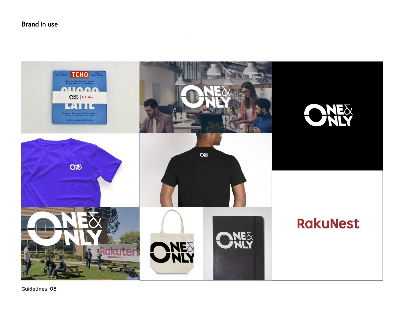
INTRO: To capture the brand’s lifestyle image and core purpose, I led the conceptual strategy and visual execution. Alongside the primary logo, I designed a tagline lockup that reinforced the brand message in a cohesive and impactful way.
BRIFE: RakuNest is a service under the Rakuten Group that supports entrepreneurs and companies striving for success in Silicon Valley through both a workspace and an online community. The brand embraces individuality and unconventional thinking — “it’s okay to be different, to take the opposite path” — with the goal of fostering innovation through collaboration.
SOLUTION: From a brand architecture perspective, RakuNest was designed as part of a “Branded House,” adhering to the parent company’s guidelines. The service logo was created to work seamlessly with the RakuNest identity, while also standing alone as a design that reinforces the spirit of its slogan.
My role: Art Director, Senior Brand Designer, Production Lead
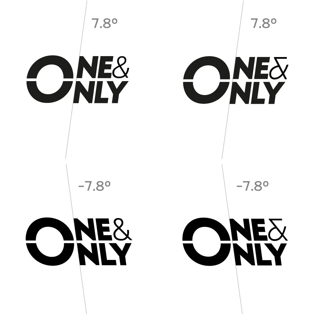
What may first look like a conventional italicized logo is, in fact, a reverse italic. This subtle twist symbolizes the idea that “it’s okay to be different, to take the opposite path”, visually embodying RakuNest’s spirit of innovation and individuality.